Spatial interfaces (on mobile)
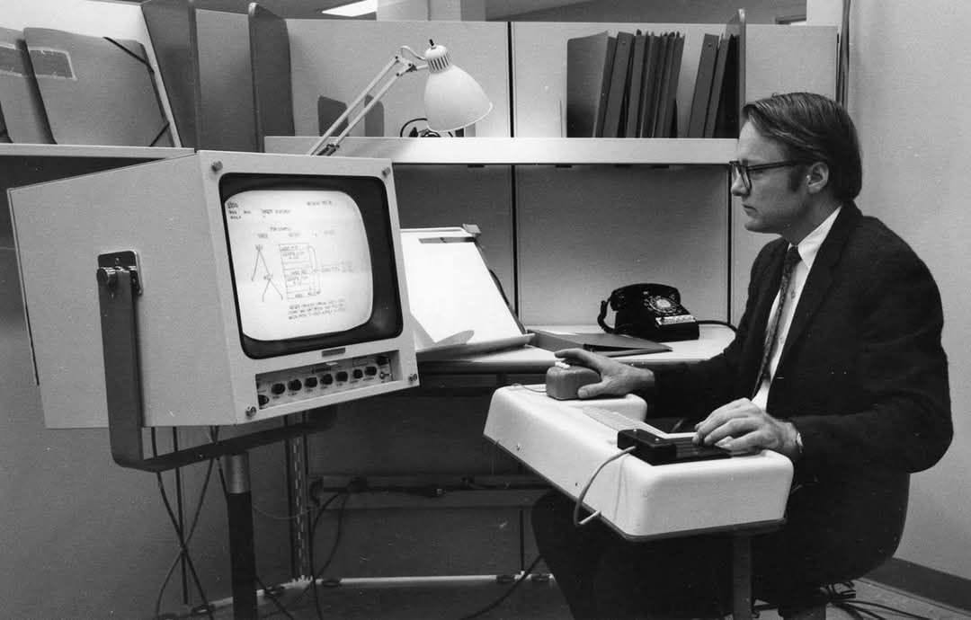 Douglas Engelbart mouse demo from 1968
Common on desktop computing (where the ui 'desktop' metaphor comes from of course) but sadly fallen out of fashion in recent years, and rarely done on mobile. Mobile interfaces try and hide how much information and interaction points are exposed to the user by squirrelling them away in menus/overflows, dialogs, bottomsheets, cramming too much into a small space with the additional obsession from designers of trying to put everything above-the-fold (most ui problems in traditional mobile design can be solved by simply embracing the infinite vertical inertial scroll phone UIs have but that's another discussion).
 |
 |
 |
|---|
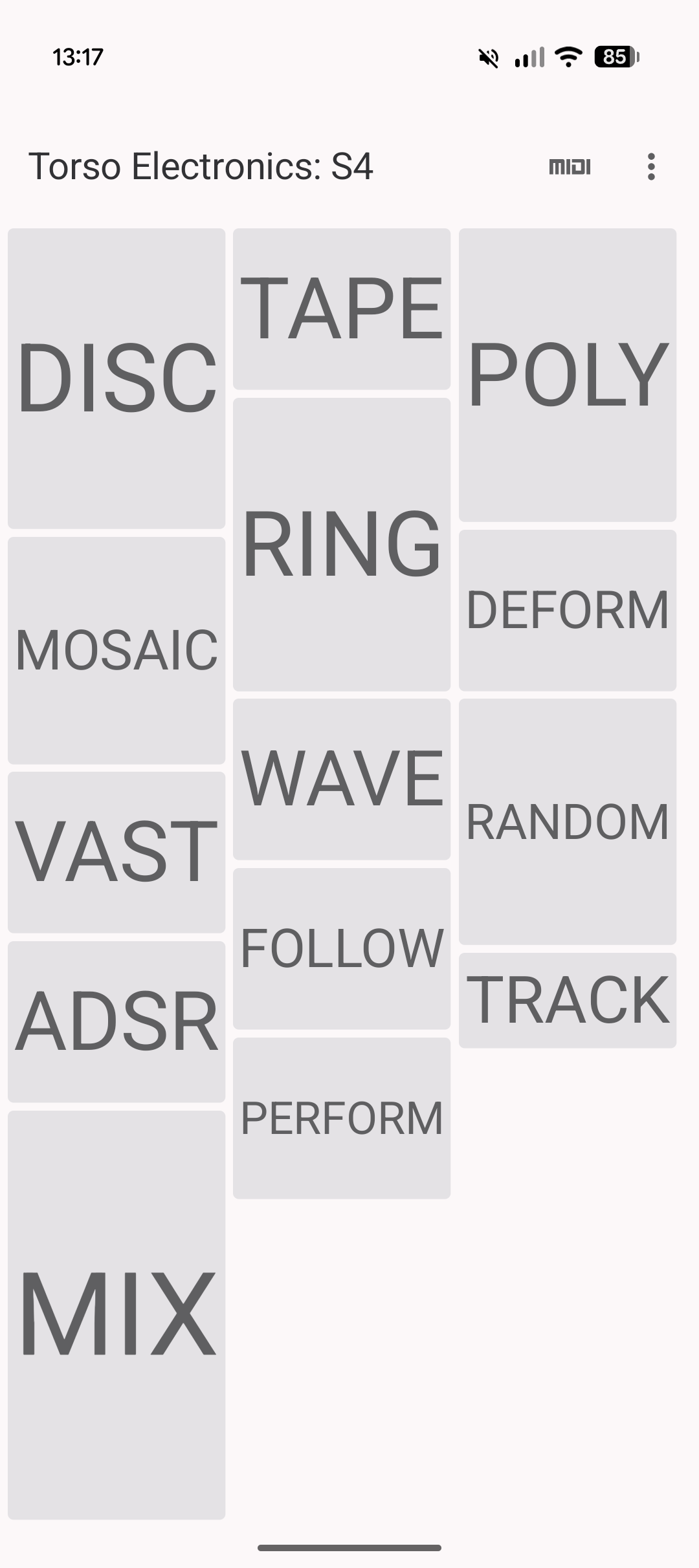
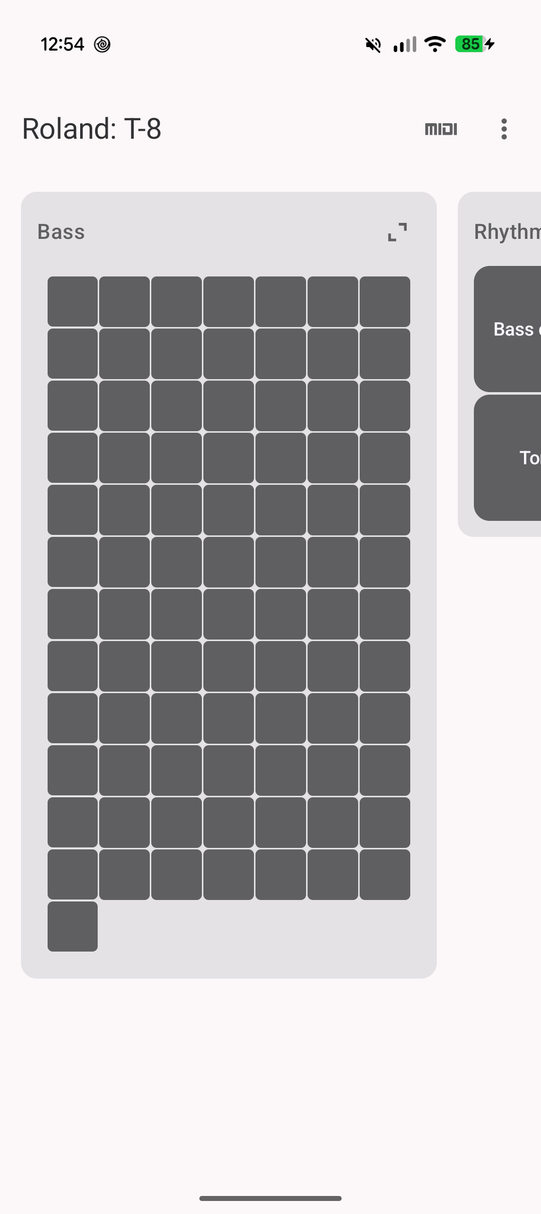
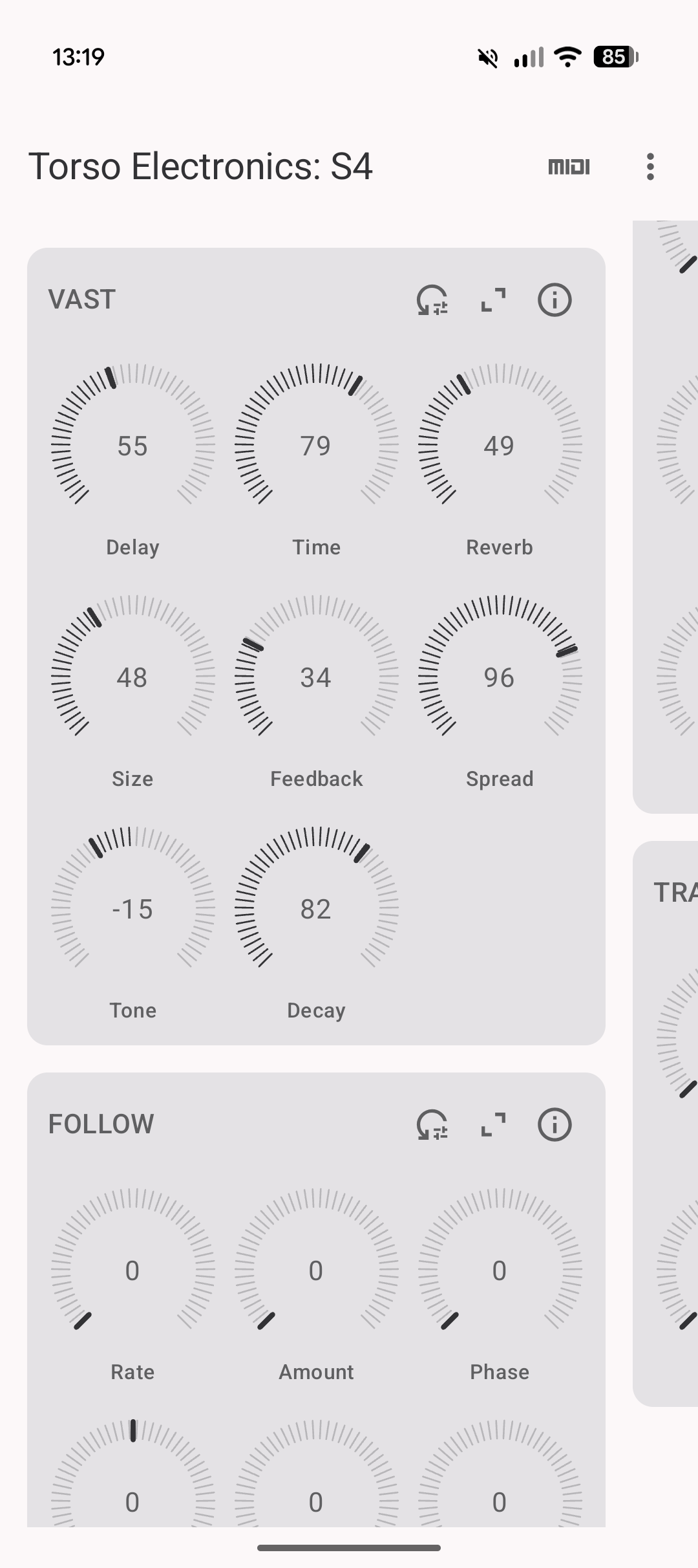
Lots of Yorkshire Systems projects involve a 2D canvas/patch/workspace with nodes. Both Modular Play and Resonance on PlayDate have a patch space where items are placed in 2d space, this continued to the Android Resonance rewrite and more recently in MIDI Map where groups of controls exist in a dynamically created masonry-like layout. This masonry layout was used partly out of necessity; it seemed like the best way to pack an unknown number of groups together, with each group containing an unknown number of controls. One unintended feature of this interface is how much better the zoom-out > find section > zoom in experience is than any standard mobile ui mechanism for switching between sections. This would normally be done with a dropdown menu, a grid, or a horizontal pager.
MIDI Map controlling a Torso S-4A dropdown is fine for a menu, but for switching between a number of disparate sections/groups it feel slow and has high cognitive friction. A pager has the problem of having to go through every intermediate section when you go from first to last index. A uniform grid layout of squares might seem like an easier solution but the uniform shape and size is part of the problem, the users eyes still have to find the section they're looking for by reading the labels. MIDI Map is designed to be used in a live music environment, the zoomable masonry-style layout has a happy side-effect: sections are tied to a place in 2D space, and they have a size and shape that helps the brain find them quickly. It gives the controls a solid location in space which reduces the friction when hopping about from one MIDI CC section to another. After using a particular hardware's MIDI Guide file for a while you have a muscle memory for where various controls live and you switch between them without thinking, there's much less overhead. The decision to show a large text label instead of the controls when zoomed out was originally a performance consideration but after using it for a while it's proven to have much better UX too.
Modular Play runing on a PlayDate with video mirrored on a small screen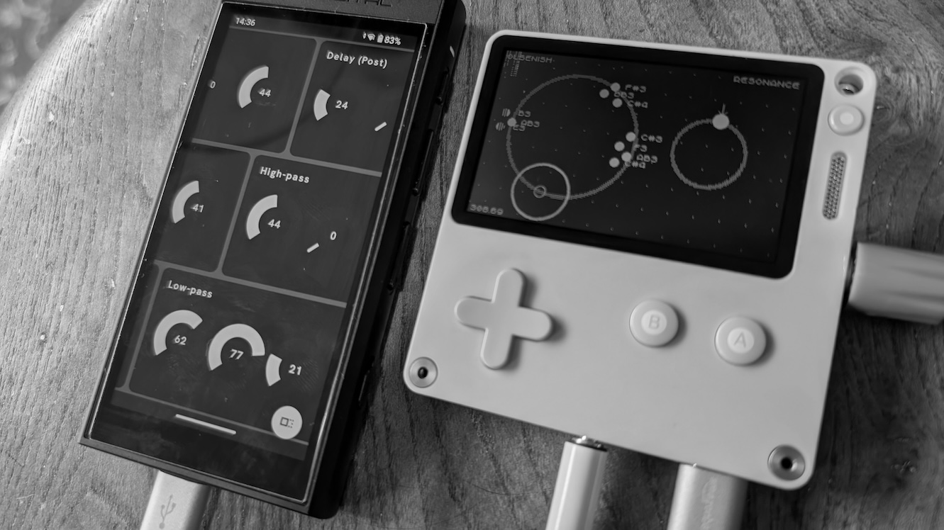 The original Resonance audio software on PlayDate with experimental web interface running on a small Android device